
English Porcelain and Ceramics: A Beginner’s Guide to the Periods
English Porcelain & Ceramics: How to Choose the Period
A simple guide to the visible differences between the English ceramic periods most often encountered at auctions, fairs, markets and in family collections.
The periods at a glance
| Approximate date | Period | First visual impression |
|---|---|---|
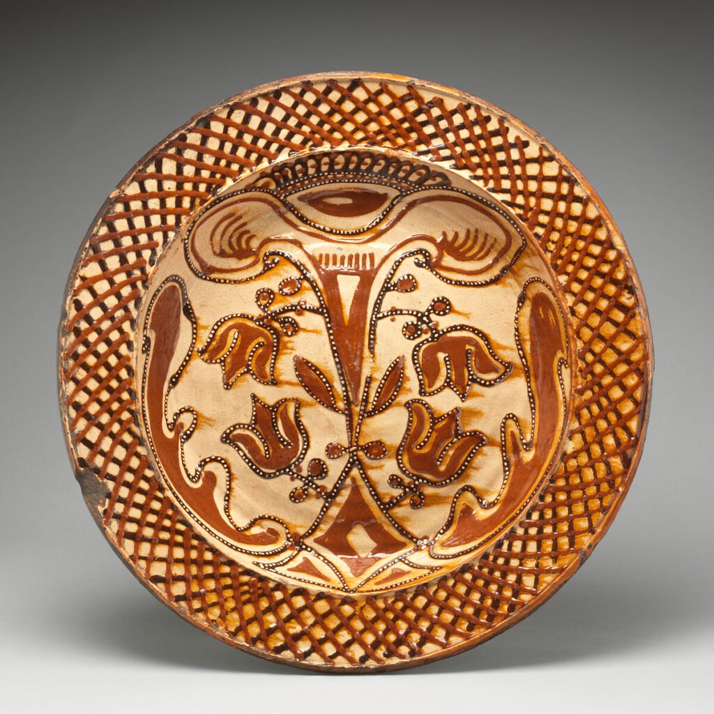
| c. 1660–1740 | Stuart & Early Georgian | Rustic, hand-made and strongly glazed: delftware, slipware and stoneware. |
| c. 1740–1775 | Early Georgian / Rococo | Chinese-inspired blue and white, colourful enamels, curved Rococo forms and early porcelain. |
| c. 1775–1811 | Late Georgian / Neoclassical | Cleaner classical outlines; cream, cool pearlware blue, black basalt and white sprigging. |
| c. 1800–1830 | Regency taste | Rich gilding, deep coloured grounds, red-blue-gold Imari and formal classical shapes. |
| 1837–1901 | Victorian | Ornate, abundant and varied: figures, majolica, transferware and richly modelled porcelain. |
| c. 1870–1914 | Aesthetic / Arts & Crafts / Edwardian | Natural forms, art pottery, lustres, tube-lining and greater attention to the individual artist. |
| c. 1918–1939 | Interwar / Art Deco | Bright colours, geometry, stylised flowers and landscapes, angular modern shapes. |
| c. 1945–1980s | Post-War / Vintage | Cleaner practical forms, coordinated tableware, printed patterns and studio-style glazes. |
| c. 1980–Present | Contemporary / Studio | The named maker, signature, provenance and individual artistic practice become central. |
Identify the ceramic body
English delftware
Usually c. 1600–1800. Tin-glazed earthenware with an opaque white surface, often painted in cobalt blue, manganese purple, green or yellow. Chips usually reveal a buff or reddish earthenware body beneath the white glaze.
Stoneware
Hard, dense and non-porous. Salt-glazed examples may have a grey or brown “orange-peel” surface. Common forms include jugs, tankards, mugs, storage vessels and later Doulton Lambeth art wares.
Creamware
Especially c. 1760–1820. Light, refined earthenware with a warm cream body under a clear glaze. Closely associated with Wedgwood’s “Queen’s Ware,” but made by many Staffordshire and Yorkshire potteries.
Pearlware
Especially c. 1775–1840. Cobalt was added to the glaze to counter the yellow tone of creamware. Look for a cooler bluish-white cast and blue pooling around the foot, handles or moulded details. Blue decoration alone does not prove pearlware.
Porcelain
White, fine and often translucent. Early English soft-paste porcelain appears from the 1740s. Tea bowls, cups, saucers, plates, sauceboats and figures are frequent Georgian forms; many early pieces are unmarked.
Bone china
A strong, translucent porcelain body containing bone ash, perfected commercially around 1800 and widely used during the Regency, Victorian and later periods. It is common in decorated tea and dinner services.
The beginner’s period guide
Delftware, Slipware and Salt-Glazed Stoneware
Common finds: chargers, plates, tiles, posset pots, mugs, jugs and tankards. Decoration is usually hand-painted or trailed in coloured slip; forms can feel robust and the glaze may be uneven.
Period clue: an opaque white tin glaze with chips showing coloured clay suggests English delftware; combed or trailed clay decoration suggests slipware; a hard grey-brown body with an orange-peel surface suggests salt-glazed stoneware.
The First English Porcelain Factories
Common finds: tea bowls, coffee cups, saucers, small plates, sauceboats and figures. Early bodies can be slightly creamy or uneven, and factory marks are often absent. Blue-and-white patterns followed Chinese prototypes; colourful enamelled wares mixed Chinese, Japanese and European Rococo ideas.
Worcester clue: the first Worcester factory was founded by Dr John Wall and partners in 1751. Early “Dr Wall period” Worcester is particularly associated with durable soapstone porcelain, blue-and-white tea wares, transfer printing, polychrome enamels and later scale-blue grounds.
Porcelain imported from the great Jingdezhen kilns gave English factories models for bodies, shapes and blue-and-white decoration. Chinoiserie, however, means a European interpretation of Chinese taste—it does not prove that an object was made in China.
James Giles (1718–1780) ran an independent London decorating business rather than a porcelain factory. His workshop decorated blank wares from Worcester, Chelsea-Derby, continental Europe and China; some imported Chinese porcelain was therefore painted or enriched in London.
The exchange later worked the other way too: Chinese export workshops produced porcelain to European orders, copying supplied shapes, armorials, prints and designs. Attribution should separate where the porcelain body was made from where it was decorated.
Pearlware, Creamware, Jasperware and Toby Jugs
Common finds: creamware tableware, blue-tinted pearlware, blue-and-white transferware, black basalt, coloured jasperware, figures and character or Toby jugs. Classical urns, laurel borders, fluting, sprigged relief and more restrained forms replaced much Rococo movement.
Period clue: check the glaze where it pools. A cool blue tint is a useful pearlware clue. A seated drinker holding a jug or mug is the classic Toby type, popular from the late eighteenth century and repeatedly revived later.
Rich Gilding, Strong Grounds and Elegant Shapes
Common finds: tea and coffee services, dessert plates, cabinet cups, sauce tureens and vases. Expect generous gilding, deep cobalt or mazarine blue, salmon, green and red grounds, Imari palettes, botanical painting, landscapes in reserved panels and crisp classical shapes.
Fast Regency clue: lavish gold + a strong coloured ground + a formal classical shape is an excellent place to start. At Worcester, flat mirror-like gilding appeared under Flight from 1789, while the Prince of Wales favoured rich red, blue and gold Imari designs. Always check for later Victorian or twentieth-century revivals.
Industrial Variety and Ornamental Abundance
Common finds: Staffordshire flatback figures, transfer-printed dinnerware, ironstone, lustreware, Parian figures, colourful majolica, bone china services and heavily modelled ornamental wares. Marks become more common, but “England” is generally a later nineteenth-century clue rather than an early Georgian one.
Period clue: early Victorian ceramics often revive Rococo scrolls and flowers; mid-century majolica uses brilliant coloured lead glazes; later Victorian work ranges from mass-produced tableware to finely painted Royal Worcester and Doulton art pottery.
Nature, Design and the Individual Decorator
Common finds: art pottery, tiles, vases, plaques and refined tableware. Look for stylised plants and animals, lustres, tube-lined decoration, experimental glazes and artist or decorator signatures. Royal Worcester fruit, birds and flowers may carry a painter’s signature as well as a factory mark.
Period clue: decoration begins to look designed as a complete surface rather than merely placed inside a border. Hand craftsmanship and natural motifs sit beside increasingly sophisticated factory production.
Bright Colour and Modern Pattern
Common finds: tea sets, jugs, vases, bowls and decorative tableware. Geometric shapes, strong colour blocks, stylised landscapes and flowers, angular handles and printed backstamps are typical. Pattern name, shape number and decorator mark can matter as much as the factory.
Period clue: energetic geometry and simplified modern motifs point towards Art Deco; tube-lined flowers and rich glazes may suggest Moorcroft; bright hand-painted landscapes may suggest Clarice Cliff—but later editions and reproductions must be checked.
Designer Tableware for the Modern Home
Common finds: dinner services, coffee sets, storage jars, studio-style vases and giftware. Cleaner profiles, repeating printed patterns, matte or speckled glazes and oven-to-table stoneware are characteristic. Designer, pattern, colourway and completeness usually guide collectability.
Period clue: streamlined forms and coordinated household ranges usually indicate post-war design rather than an earlier handmade period—even when the decoration borrows historical motifs.
The Maker Becomes Central
Common finds: signed functional pottery, sculptural ceramics, limited editions and continuing factory ranges. A handwritten mark is only the beginning: confirm the maker, date, exhibition history, quality and whether the form belongs to an established body of work.
Period clue: contemporary work may deliberately imitate delftware, slipware, Regency porcelain or studio pottery. Provenance and a documented maker matter more than style alone.
Six details worth checking
1. Body and glaze
Porcelain, bone china, pearlware, creamware, delftware or stoneware?
2. Shape
Is the form right for the proposed period, or is it a later revival?
3. Decoration
Hand-painted, transfer-printed, moulded, tube-lined, enamelled or gilded?
4. Marks
Read every printed, impressed, incised and painted mark—without trusting it alone.
5. Condition
Look for cracks, staining, replaced handles, regilding, overpainting and restoration.
6. Market identity
Factory, pattern, artist, rarity, pair or complete set all affect desirability.