Cafe au lait / Batavian Brown
Historical Overview
☕ Café-au-Lait / Batavian Brown Porcelain
Café-au-Lait / Batavian Brown Porcelain — How to Read It
Beginner view:
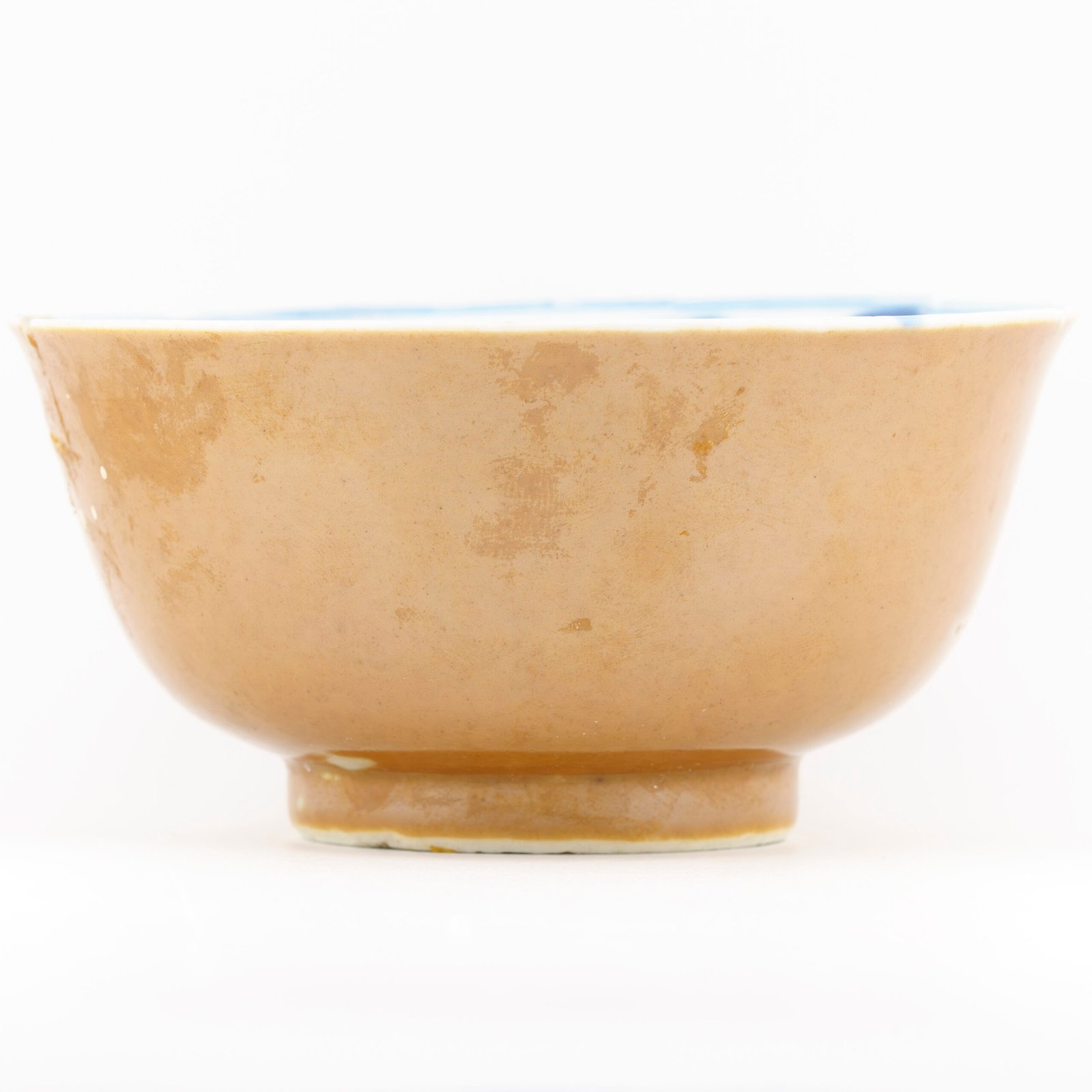
Café-au-lait porcelain is Chinese export porcelain covered with a warm brown glaze, ranging from pale coffee-milk tones to deep Batavian brown. It was especially popular in the late 17th and early 18th centuries, often made for European trade.
For beginners, focus on:
These pieces were admired because they felt elegant, fashionable, and slightly mysterious — hiding their decoration until lifted or turned.
Café-au-lait porcelain is Chinese export porcelain covered with a warm brown glaze, ranging from pale coffee-milk tones to deep Batavian brown. It was especially popular in the late 17th and early 18th centuries, often made for European trade.
For beginners, focus on:
- A brown exterior glaze that feels soft, warm, and even
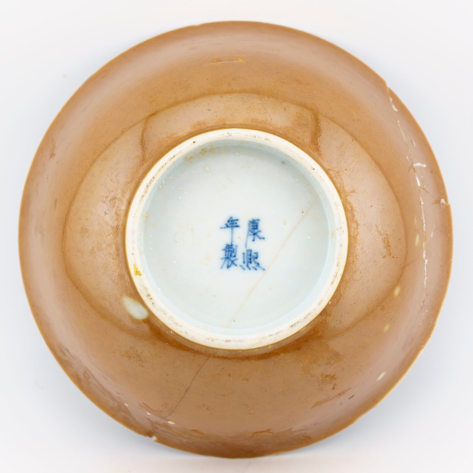
- A contrasting interior (blue & white, famille verte, famille rose, or simple floral sprays)
- Small tea wares: cups, bowls, saucers are most common
- Wear that feels natural rather than harsh or chalky
These pieces were admired because they felt elegant, fashionable, and slightly mysterious — hiding their decoration until lifted or turned.
Expert view:
Café-au-lait and Batavian wares are best understood as a specialised branch of iron-oxide monochrome glazing developed for export markets, particularly those connected to VOC trade networks.
Experts prioritise:
Many examples were later altered in Europe, and surviving pieces often represent multiple cultural stages rather than a single moment of production.
Café-au-lait and Batavian wares are best understood as a specialised branch of iron-oxide monochrome glazing developed for export markets, particularly those connected to VOC trade networks.
Experts prioritise:
- Glaze chemistry: iron-oxide concentration and kiln atmosphere control
- Surface texture — silky vs slightly granular indicates firing conditions
- Interior/exterior dialogue: brown outside paired with underglaze blue or enamels
- Relationship to Batavia (VOC hub) rather than place of manufacture
- European intervention: wheel-engraving, silver decoration, later mounting
- Dating by glaze tone and pairing logic, not marks
Many examples were later altered in Europe, and surviving pieces often represent multiple cultural stages rather than a single moment of production.
Chinese Export Monochrome & Combination Decoration
Collector Confidence Meter — Café-au-Lait / Batavian Brown
Slide to see how attribution confidence increases as more evidence aligns →
⬅ move
move ➡
75% confidence
Brown glaze and general form suggest Café-au-Lait ware, but pairing and glaze tone require closer study.
🧱 What You’re Actually Looking At
Batavian ware is not a kiln name, not a single style, and not a fixed period.
The term “Batavian” refers to a trade route and commercial context, not a place of manufacture.
These porcelains were produced in China (primarily Jingdezhen), passed through
Batavia (modern Jakarta) as a VOC redistribution hub, and were often
finished, altered, or reworked in Europe.
What defines Batavian ware is therefore a combination of factors:
What defines Batavian ware is therefore a combination of factors:
- Iron-based brown glaze (from pale café-au-lait to deep Batavian brown)
- Export-driven forms rather than court shapes
- Decorated interiors designed for contrast and “table-side reveal”
- Frequent later European additions such as engraving, mounts, or replacements
In other words: Batavian ware should be read as a journey, not a single moment of production.
1. Overview
Café-au-lait, also known as Batavian brown, refers to a family of warm brown glazes applied to Chinese porcelain, most prominently produced for export during the late 17th and 18th centuries.
While visually understated when compared to blue and white or famille rose, these wares represent some of the most technically controlled and culturally layered ceramics produced at Jingdezhen.
They are defined not by surface decoration alone, but by:
- glaze chemistry
- firing control
- exterior/interior contrast
- and strong European taste influence
Café-au-lait porcelain is less about imagery — and more about material sophistication.
⚠️ Don’t Date This by Colour Alone
Brown glaze is not a date stamp.
Café-au-lait and Batavian brown glazes appear across multiple centuries and
in different technical contexts.
Similar shades can result from:
As a result, colour alone cannot securely date a piece, and identical tones may span from the late 17th to the 19th century.
- Different iron concentrations in the glaze
- Variations in firing atmosphere and temperature
- Deliberate aesthetic choices for export markets
- Later experimental revivals or kiln adaptations
As a result, colour alone cannot securely date a piece, and identical tones may span from the late 17th to the 19th century.
Reliable dating requires a convergence of indicators, including:
- Form and profile
- Interior decoration style and brushwork
- Glaze behaviour at footrim and rim edges
- Context of export trade and known comparanda
In Batavian ware, colour describes intention — not chronology.
2. Terminology & Naming (important for collectors)
| Term | Meaning |
|---|---|
| Café-au-Lait | European descriptive term for a pale brown glaze resembling coffee with milk |
| Batavian Brown | Darker, richer iron-brown glaze associated with Dutch trade routes |
| Batavian Ware | Export porcelain linked to VOC distribution via Batavia (Jakarta) |
| Brown Monochrome | Neutral technical term covering the full tonal range |
⚠️ Important
These are collector terms, not Chinese period names. Chinese kiln records describe materials and firing, not colour names in this way.
3. Historical Context & Trade (VOC connection)
Batavian brown porcelain is inseparable from European maritime trade, especially:
- Dutch East India Company (VOC)
- Swedish East India Company
- Northern European markets (Netherlands, Scandinavia, Germany)
Large quantities were shipped:
- via Batavia (Jakarta)
- to Europe and the Americas
- alongside blue & white cargoes
Shipwreck evidence (Ca Mau, Geldermalsen, Wanjiao No.1, etc.) confirms café-au-lait wares were standard export products, not experimental novelties.
4. The Brown Glaze – Technical Character
The glaze is primarily derived from iron oxide, fired at high temperature under controlled kiln atmospheres.
Key characteristics:
- iron content carefully balanced (too much = blackening)
- reduction firing essential
- glaze often thicker than blue & white
- subtle pooling at foot rims and edges
Colour range:
- pale café-au-lait
- warm milk chocolate
- deep Batavian brown
- near-black iron brown (rare)
Even small kiln variations could change the final colour dramatically.
5. Exterior / Interior Duality (signature feature)
One of the most recognisable traits is the dual-surface concept:
Common combinations:
- Brown exterior / Blue & White interior
- Brown exterior / Famille verte interior
- Brown exterior / Famille rose interior
- Brown exterior / Monochrome interior with enamel reserves
This duality created:
- visual surprise
- luxury appeal
- ambiguity when viewed from different angles
Collectors often describe these pieces as “revealing themselves slowly”.
6. Forms & Object Types
Most café-au-lait porcelain appears in functional forms, reflecting European dining habits:
- tea bowls & saucers
- cups
- dishes & plates
- small bowls
- vases (less common, higher status)
Large sculptural forms are rare and often later.
7. Chronology (high-level, honest)
While brown glazes existed earlier in China, café-au-lait export wares cluster mainly in:
- Kangxi period (1662–1722) – dominant
- Yongzheng period (1723–1735) – refined
- Early Qianlong (1736–c.1750) – continuation
Later centuries continued production, but body texture, glaze feel, and firing differ.
This is where experience matters.
8. European Intervention & Alteration
Some café-au-lait wares were later:
- wheel-engraved
- silver decorated
- mounted
- gilded
Often done in:
- Netherlands
- Germany
- England
These are historical layers, not damage — and should be documented, not dismissed.
9. Attribution Challenges (why this section matters)
Café-au-lait porcelain is frequently misattributed because:
- colour varies naturally
- later wares imitate earlier tones
- lighting changes perception
- interiors are sometimes overlooked
Correct attribution relies on:
- glaze texture
- foot rim finish
- body colour
- interior/exterior relationship
- comparative examples
10. Collector’s Confidence Range (framework)
Instead of false certainty, we present confidence bands:
Decorative confidence – correct style, later production possible
High confidence – multiple matching indicators
Moderate confidence – strong glaze + form, fewer references